ShopDreamUp AI ArtDreamUp
Deviation Actions


Suggested Deviants


Suggested Collections


You Might Like…


Featured in Groups

Description
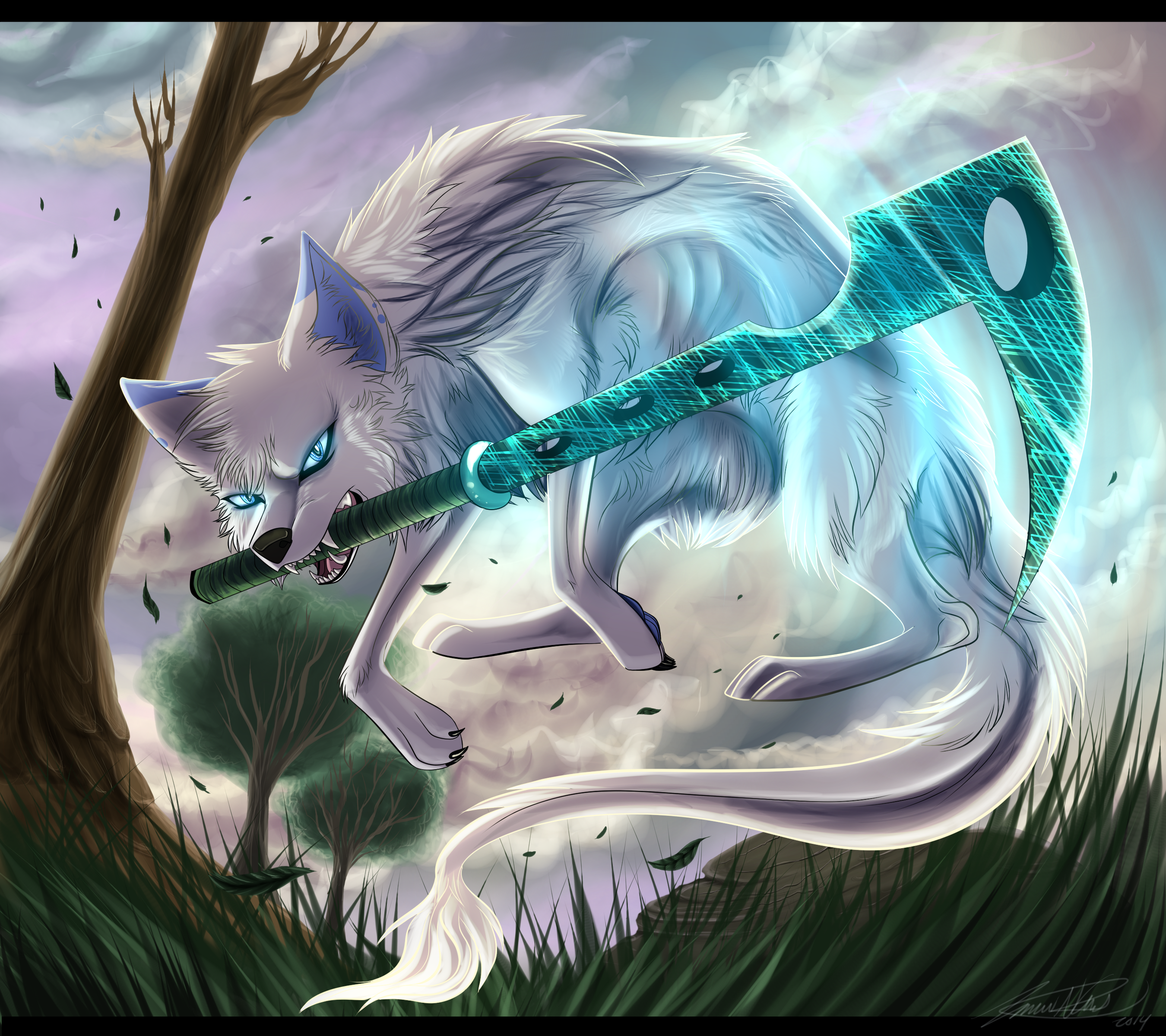
Another commission for DemonWolfAtreiyu
((I designed the sword myself cuz she wanted me to ;U; ))
Pff, I worked almost all day on this one xD So I hope you like it!
No layer modes were used for the bg this time... Only normal mode (Smile)") No color picking whatsoever and no refs xD I guess Im happy with the outcome
No color picking whatsoever and no refs xD I guess Im happy with the outcome ")
I hope you all like this!
ONLY ATREIYU MAY USE THIS.
Thanks so much for commissioning me!

SLOTS ARE FILLED!!
Art [c] Me
Character [c] Atreiyu
((I designed the sword myself cuz she wanted me to ;U; ))
Pff, I worked almost all day on this one xD So I hope you like it!
No layer modes were used for the bg this time... Only normal mode
I hope you all like this!
ONLY ATREIYU MAY USE THIS.
Thanks so much for commissioning me!
SLOTS ARE FILLED!!
Art [c] Me
Character [c] Atreiyu
Image size
2700x2400px 6.9 MB
© 2014 - 2024 Shiinrai
Comments37
Join the community to add your comment. Already a deviant? Log In
I'm back. Muahaha.
And this time, since you've gotten so much better at anatomy, I'll be focusing on visual details and scenery. (Be amazed)
First, let's delve into familiar territory here. I'm not sure whether this is a wolf or a fox...
If it's a fox, then the body proportion is a bit off; it's a little too big.
If it's a wolf, then the head proportions, specifically the ears, make it seem like a fox.
But, I have to admit, beyond that, I find little else wrong with it.
Except for one thing that's really, really bugging me. On it's back, just above it's shoulders, the fur gets darker, and the lines also grow darker. Fair enough.
But, above that patch of darker fur there are black lines outlining fur that shouldn't be there. Or at least, shouldn't be black; it takes away from the glowing effect.
Then the rest of the fur in that darker patch looks a bit sketchy because you're mixing the gray with the dark-blue-ish lines. It also bugs me.
The rest, though is pretty good.
As for the scenery, it's pretty enjoyable. The blue-ish glow from the "sword" (I really want to call it a scythe) contrasts the faded pink rather nicely.
And, although the sky isn't too realistic, it's still pretty, which is what counts.
What bugs me are the trees. I don't get it, are half the branches bare? Even if you do want to show the branches, they should still have some leaves on them....
Overall, I rather enjoyed it. Even with the things that bug me, it still is a pretty neat piece. I hope you keep on improving.